Debian 12: First Impressions
Another Solid Release with a Fresh Coat of Paint
Last month the world was graced by the arrival of a new version of Debian GNU/Linux, or as I've recently taken to calling it, GNU plus Linux. This latest release — codenamed Bookworm — had a lot of hype surrounding it with its inclusion of the non-free sources in the main ISO file. While the non-free ISO had previously been available, it was not exactly easy to find as the project’s focus was much more on the free ones.
Now I’ve liked Debian for a long time… or perhaps more accurately, I’ve wanted to like Debian for a long time. It’s not that it’s ever been a bad distro, it’s just never really been my cup of tea. In exchange for the stability that you receive from Debian you sacrifice the availability of the latest software packages which is why most of my Linux usage over the years has been on Ubuntu and its derivatives. Sure I’ve also messed around with Fedora, CentOS, and Arch, but really I’ve been an Ubuntu-based — and consequently a Debian-based — kind of guy. However, as I’ve gotten older I’ve grown to want a more stable, slower-moving operating system. With that in mind, I have continued to try out each new major version of Debian since Wheezy, so here are my first impressions of Debian 12: Bookworm.
Getting Acclimated
Before we get started, I want to remind you that this is not a Debian 12 review. This is just me sharing my first impressions of the new release focusing mostly on what the desktop experience is like and making a few observations along the way. I plan to do a full Debian review later this year after I’ve had some time to play around with it a bit more. I have installed Debian 12 on an old Dell Latitude 3330 from about 10 years ago and it’s running well, but for this article I’m running it in a virtual machine.
During the installation process you are asked to choose a desktop environment to install. I installed them all. Gnome, KDE, Cinnamon, MATE, XFCE, LXDE, LXQT, Openbox… all of them. However, for this article I am only going to look at Gnome — particularly running on X11 as I experience some bugs when running Gnome on Wayland — since that is the default desktop. Upon first login to Gnome you are asked to choose your language, keyboard layout, and region.
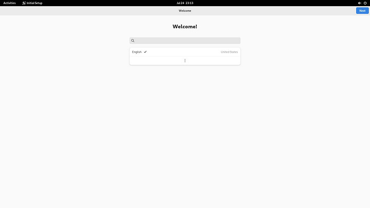
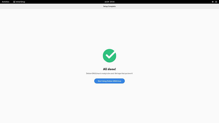
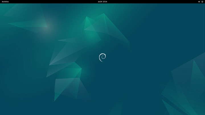
Once you do that you get dropped onto the desktop and are ready to go. The default desktop here is Gnome 43 so you do get the latest major version of Gnome. As I’ve mentioned in the past, I loved Gnome 2 back in the day but when Gnome 3 came out I just couldn’t get behind it. I tried Gnome 3 off and on over the years but in the end it just never got there. However, since Gnome 40 (i.e. Gnome 4) came out a few years ago I have grown to appreciate it more and more. Gnome 43 feels smooth and looks quite nice. I also appreciate that it does it’s own thing and isn’t trying to be like any other OS or desktop like Windows or macOS.
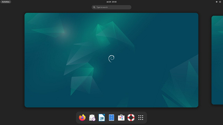
Opening the app drawer (or whatever it’s called on Gnome) shows just why exactly you don’t install a whole bunch of desktop environments at the same time. There are so many apps… so many redundant apps.
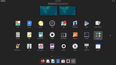
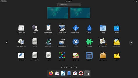
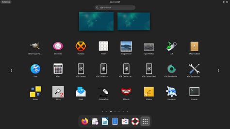
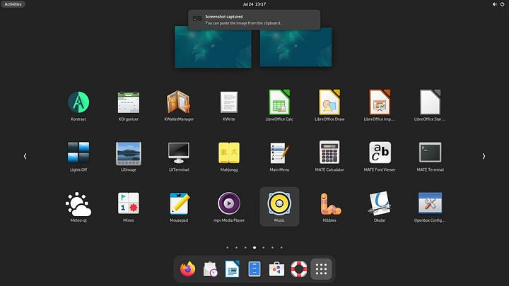
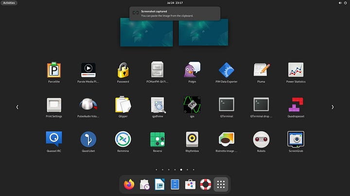
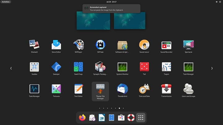
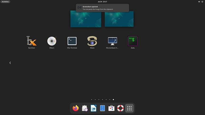
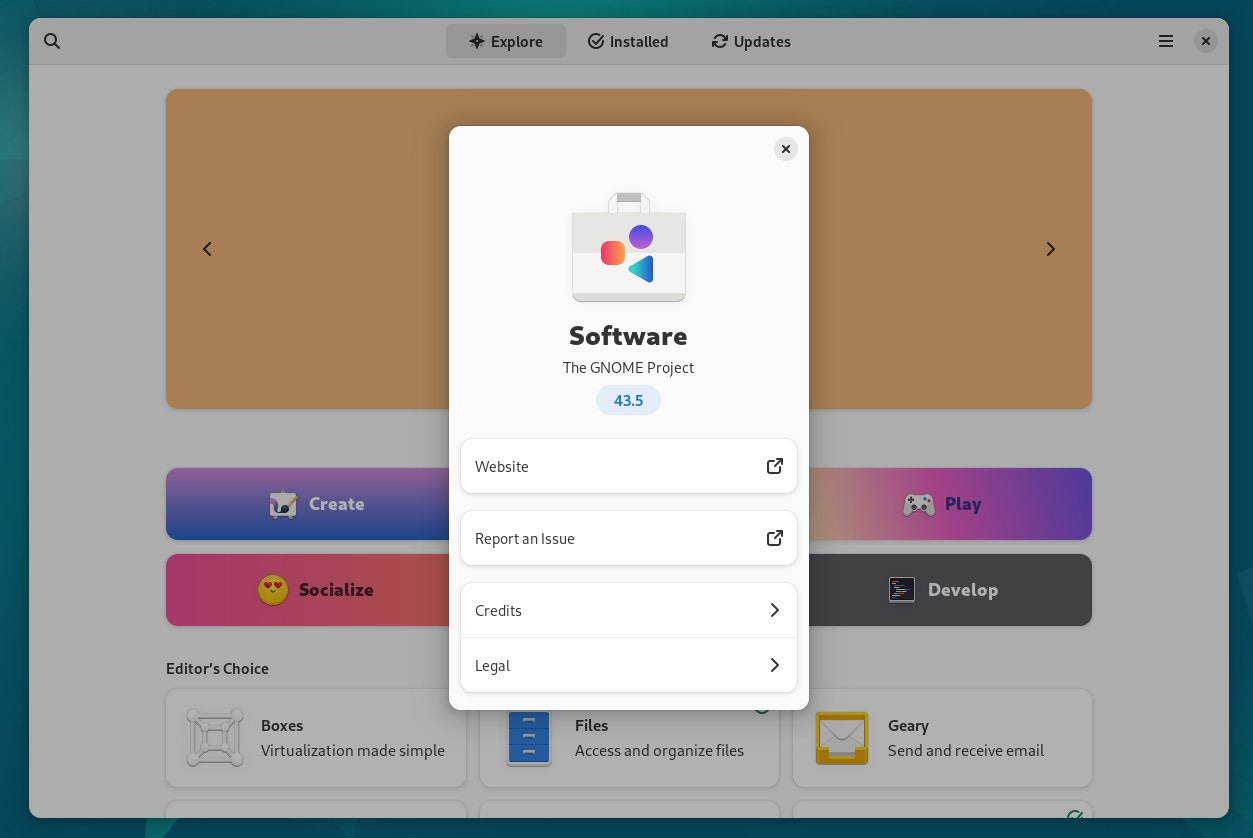
Speaking of apps, I’m old school and prefer to install things via the terminal or even using the Synaptic Package Manager, but for a modern desktop you’re expected to have a modern app store. Enter: Gnome Software. I remember back when it was the Gnome Software Center and can even recall using Ubuntu Software Center way back in 2010. I’m sure this version (43.5) is better than it used to be, but the old Gnome and Ubuntu Software Centers sucked so bad back then that I just don’t typically even think to use them anymore. I’m sure I’ll give it an honest try for the full review though. With all that said, it does look nice.
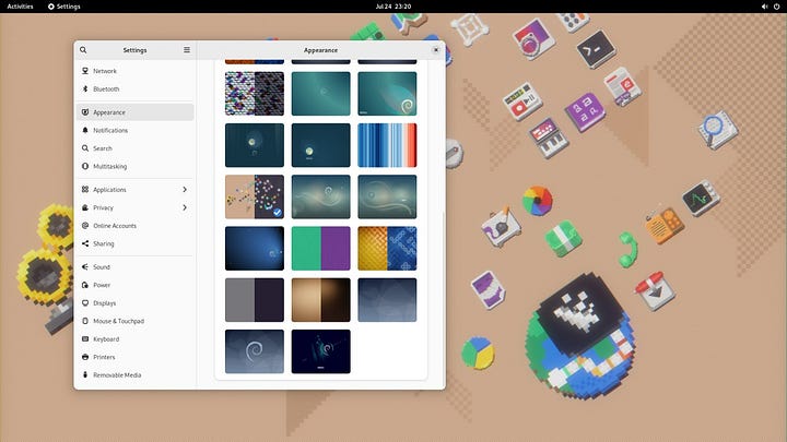
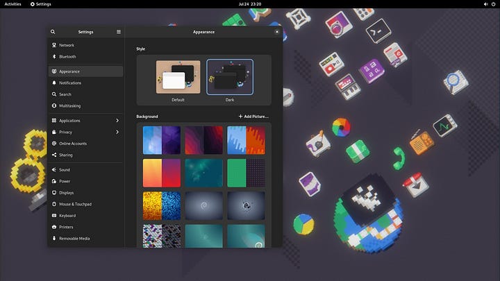
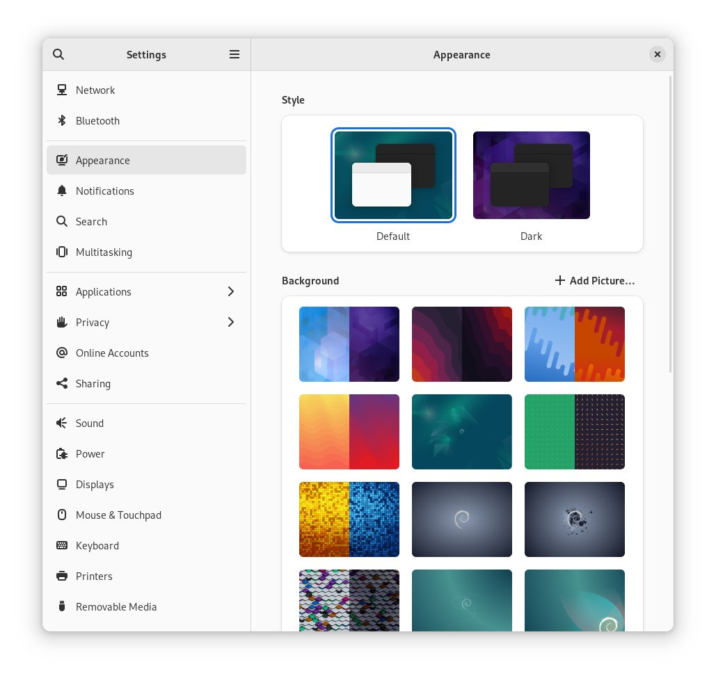
Speaking of things looking nice, let’s change that default wallpaper and theme. Moving into the Appearance settings there is a default and dark style to choose from as well as a lot of new wallpapers. One thing I was glad to see is the inclusion of dynamic wallpapers that will change with your desktop theme.
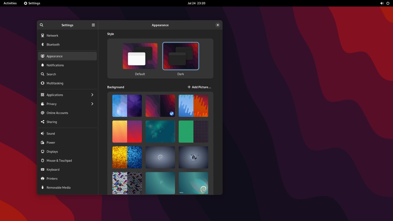
Of all of the dynamic color pattern wallpapers I liked this one the best. However it does look a little rough when blown up on my desktop monitor which is a standard 1920x1080 resolution, so it’s not a scaling issue.
Scrolling down I discovered this fun little retro wallpaper with the Gnome icons done in pixel art which is right down my alley. It’s also dynamic but I’d say the dark version is where it’s at.
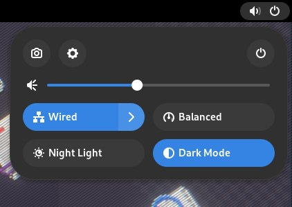
Clicking on the volume icon in the top right brought down this little control panel. I’m pretty used to having a bunch of options here but this was pretty nice. The settings were tucked away into the gear, as were the power and logoff options. There is a simple slider for the volume control, and then you have single click options to toggle between light and dark modes, night mode, power saving modes, and your network settings. I can’t remember if this was all in Gnome 42 when it came out since I spent very little time with it, but it’s a nice interface.
The notification panel drops down from the date and time in the center of the top panel. I’ve always felt like this is an awkward place for this on every version of Gnome since 3 launched back in 2011 or so. I would honestly prefer to install something like the Raven panel from the Budgie desktop in its place.
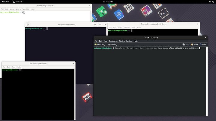
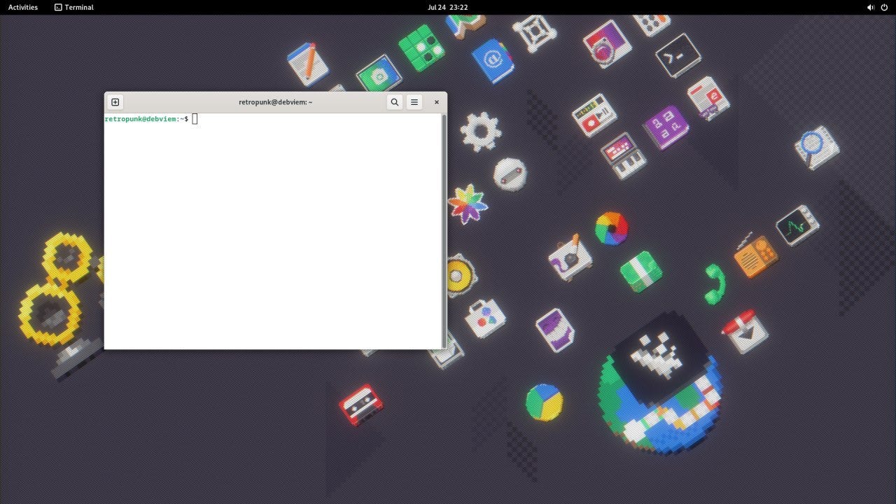
As any good Linux user does, it was time to run my updates after the fresh install so I launched the Gnome Terminal and blinded myself. Yes I switched to dark mode, and yes other apps respected the dark mode, but the terminal is bright as can be.
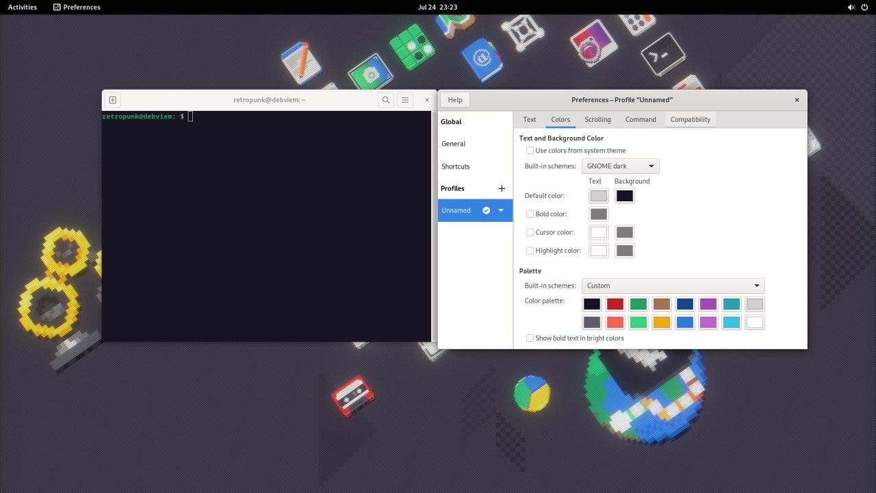
Going into preferences I adjusted the profile colors to GNOME Dark but it only adjusted the background and not the entire window.
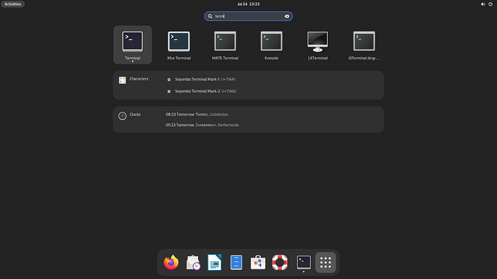
So I figured, let’s try another terminal. Having installed all the other desktops I had a plethora to choose from. However between Gnome Terminal, XFCE Terminal, MATE Terminal, Konsole, LXTerminal, and QTerminal, the only one that actually respected my desktop theming was Konsole but only kind of. It had a dark title bar, but I still had to adjust the window theme which was simple enough. It looks better than the jarring white of the light terminals, but it doesn’t really fit with the look and feel of Gnome (for obvious reasons).
Now, regaining my focus, it was time to check for updates and apply them. This is easy and takes two commands and a single yes response, but you can do this all at once with the following command:
sudo apt update && sudo apt upgrade -y
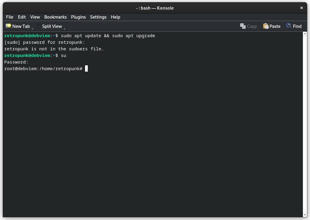
Unfortunately I forgot that on Debian you have to add your user account to the wheel group which will add you to the sudoers file which allows for privilege elevation and the command failed. Instead, I did have the root account setup so I ran the su command, entered my root password, and then re-ran the last commands. To my surprise, everything was already up to date. Perhaps the ISO I downloaded was for a newer build of Debian stable?
Default Applications
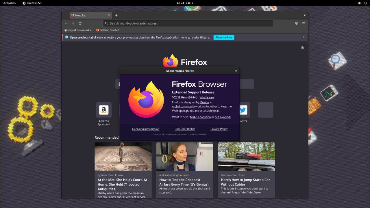
Wrapping up my first look at Debian 12, I wanted to check on some of the common applications that I use on a regular basis. First up is the web browser. Linux has a ton of web browsers to choose from, but the default one here is Firefox. As is to be expected, the software in the Debian repos is pretty far behind. Here we see Firefox 102.13 ESR which is only 13 versions behind the current Firefox 115.
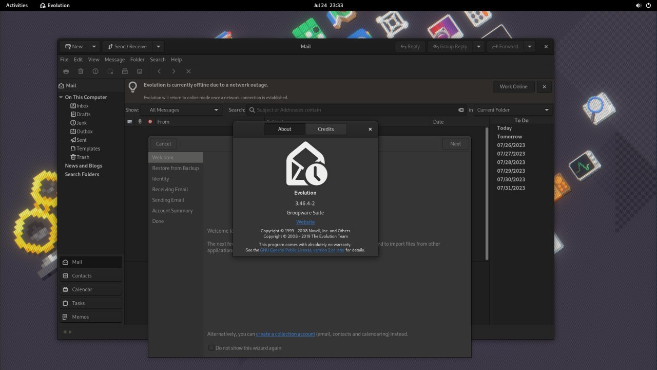
While Thunderbird is installed, it looks like the default mail client in Debian 12 is supposed to be Evolution which incidentally is my favorite client for Linux. This is version 3.46, which is only 2 versions behind the current one.
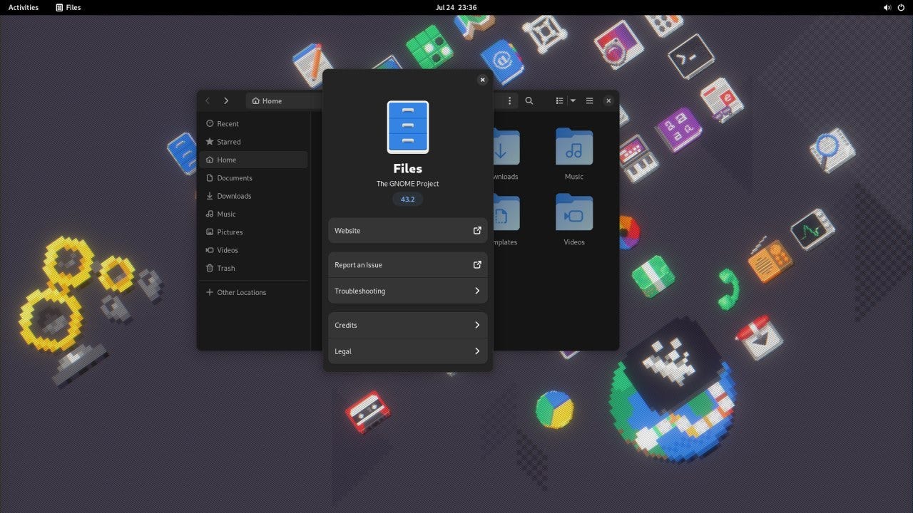
Gnome Files, aka the Nautilus File Manager, is also a version behind, but that doesn’t mean much to me at this point.
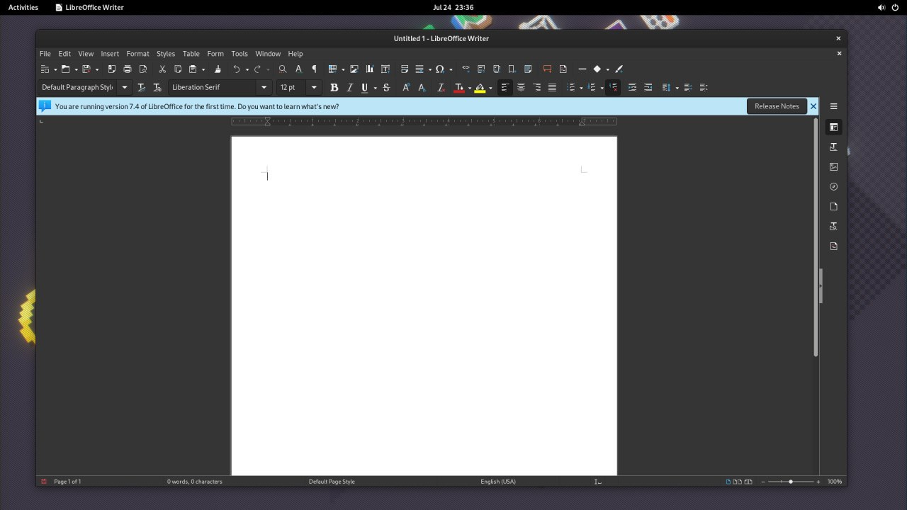
The last application I wanted to look at was LibreOffice, the free/libre office suite. Is it the best office suite? No, no it’s not. Is it a capable office suite? Yeah. Is it the best one on Linux? Maybe, but that is very subjective. In any event Debian ships LibreOffice 7.4 which is a version behind. I also don’t like the icon set they are using so let’s change that.
To change the icons in LibreOffice, go to Tools > Options > LibreOffice > View and then select the icon theme you want. In this case, I went with Colibre (SVG) which is much better.


All in all, Debian 12 is what I expected it to be. It’s a solid distro with slightly out of date, yet stable, packages. It gets out of the way and does what I need it to do. The addition of Gnome 43 really gives it a more modern look and feel to it, though the traditionalists among us would probably prefer a more traditional type of desktop which the distro makes easily available at setup.
With this VM and the Latitude that I installed it on, I will make a point of using it on a more regular basis over the next several weeks to months to give a more in depth performance review in the future. If you’re interested in seeing what Bookworm brings to the table, head on over to the Debian download page.



What a sarcastic ass. It's only 13 versions behind. You don't know enough about Debian to update this - quite easily.