On September 26, Apple released their latest version of macOS; version 14, Sonoma. It was announced earlier this year at WWDC23 back in June. Some of the more notable features from that announcement included animated wallpapers and screensavers, a simplified way of creating web apps using Safari, desktop widgets, and an improved presentation mode for video conferencing. The beta has been out for some time now, but I prefer using the public releases in order to give my takes based on what the actual end user is going to be getting. With that said, let’s get started.
Hardware Support
You need a Mac, simple as that. With Apple no longer producing Intel Macs, there are only a handful of them that are supported by Sonoma. What that means is that you can still get yourself a nice little Hackintosh but there will likely be features of the OS that you’ll have to do without. The same goes for running it on unsupported Macs, so your best bet is to run it on one of the following:
All iMacs from 2019 and later
The 2017 iMac Pro
All Mac Minis from 2018 and later
All MacBook Airs and Pros from 2018 and later
All Mac Studios, and
All Mac Pros from 2019 and later
Notable Features
Animated Wallpaper/Screensavers/Lock Screens
With the release of Sonoma, Apple basically took the Mac desktop and blended it somewhere between macOS, iPadOS, and tvOS. It’s still very much a desktop operating system, but just like what we saw with the release of Ventura last year, we’re seeing more and more of the iOS/iPadOS-ification of the desktop. Ventura brought a major overhaul to the traditional System Preferences by redesigning it to match what we see on the iPad with System Settings. Big Sur, back in 2020, saw the desktop icons lose what little bit of skeumorphism they had left in favor of the modern iOS-styled icons that continue today.
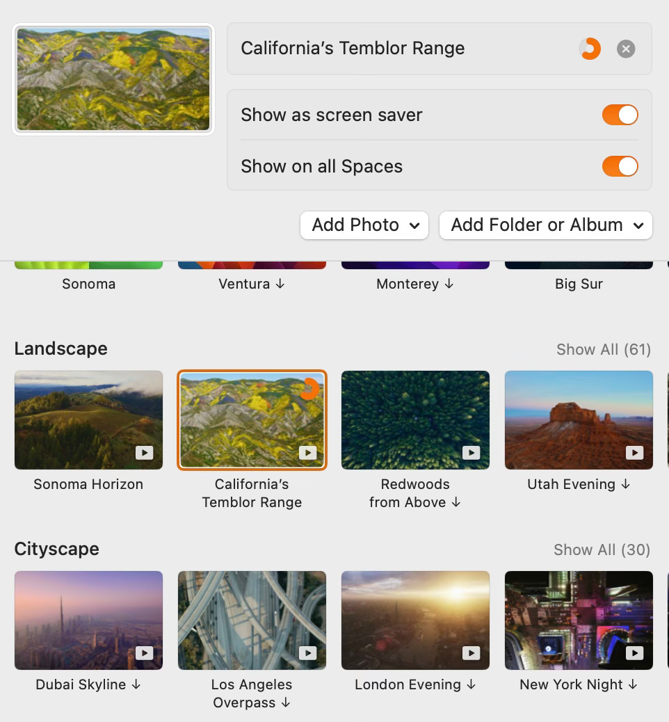
Following the path that I assume is leading to a unified UI/UX between all of their platforms, the lock screen has been changed. It sports the big time and small date that you see on iPhone and iPad. The user selection and password fields are moved out of the way to the bottom rather than being front and center, and now your lock screen is designed to be a work of art. Below is the default macOS Sonoma animated wallpaper that they wanted me to use when I first booted after the upgrade. Here is a video of the animation at work.
This animation is very similar to — and in certain cases are the actual — animated screensavers that we see on the AppleTV. These animated wallpapers serve as both the wallpaper, the lock screen, and the screensaver if you so choose.
Of course there are still the normal wallpapers to choose from. Their more abstract offerings this time include a series of colored Radial images as well as the dynamic Sonoma wallpaper they showed off at WWDC.
Desktop Widgets
It’s 2005 and OS X Tiger brings us Dashboard with new desktop widgets… wait, that’s not right. Let me try again.
The year is 2007 and Windows Vista introduces the desktop widget… Still not? Okay, okay…
The year is 2009 and Windows 7 with its desktop gadgets? No?
I know, I know. It’s 2003! Yahoo Widgets is here and Google Desktop is just on the horizon!
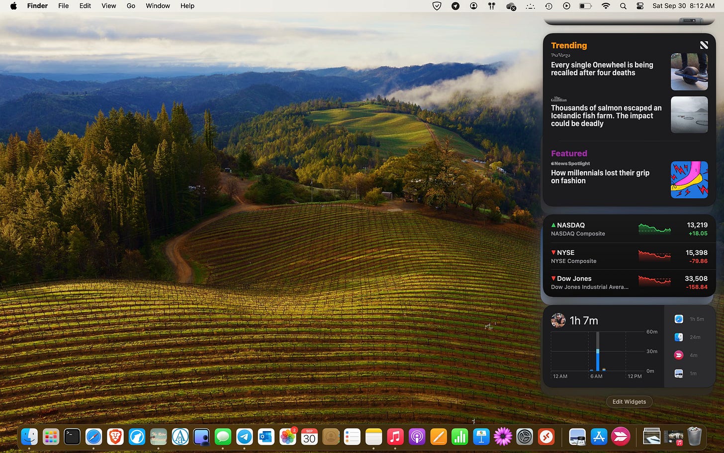
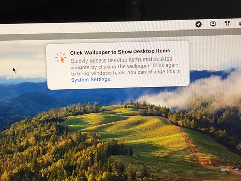
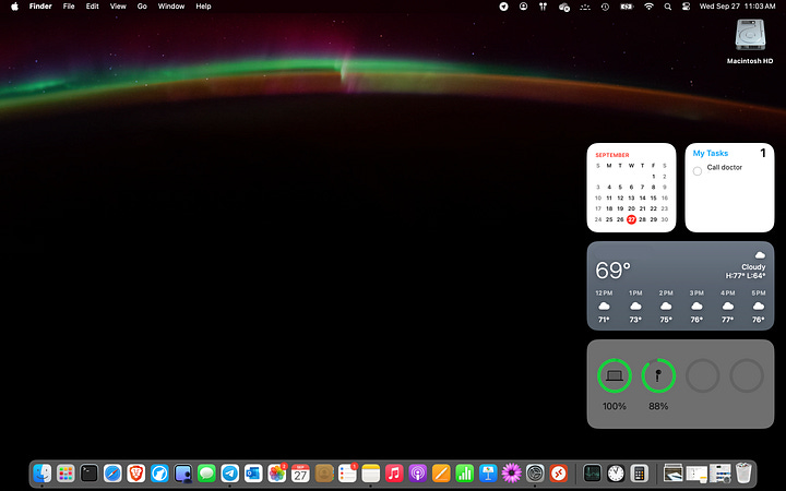
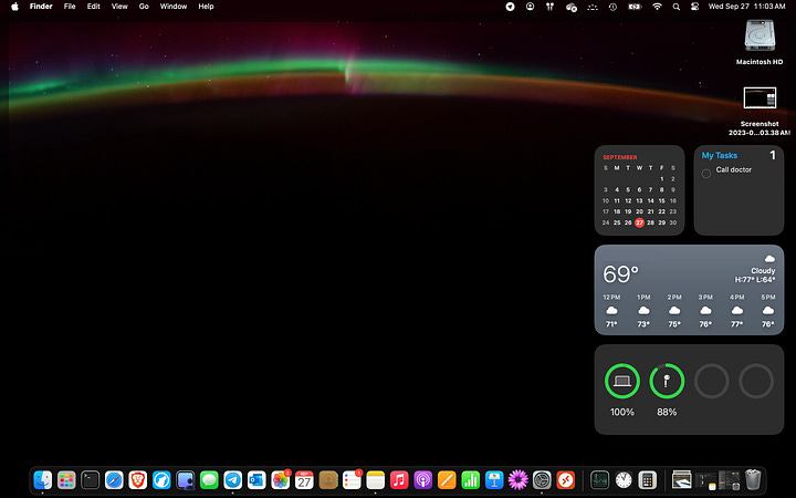
Silliness aside, it’s 2023 and Apple has decided the time for Desktop Widgets is here once more. Now, obviously, these things are completely optional, but if you want them there are two ways to add them to your desktop. The first is to click the Edit Widgets button at the bottom of the notifications panel.
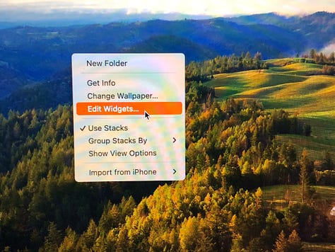
The other is to simply right click/two-finger tap/CTRL+click (whatever you have your system configured to) and choose Edit Widgets. From there, you grab the widgets you want and drag them to the desktop.
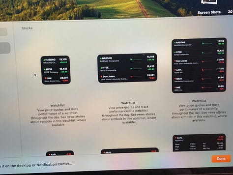
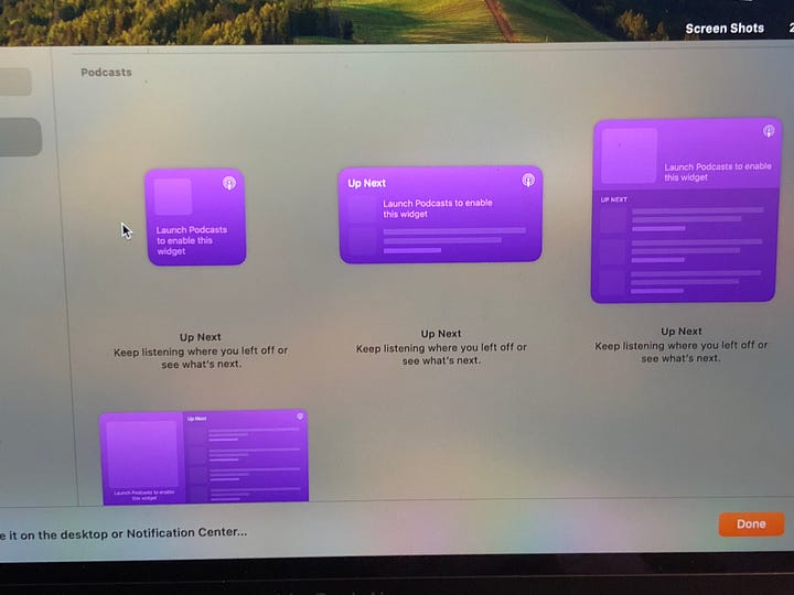
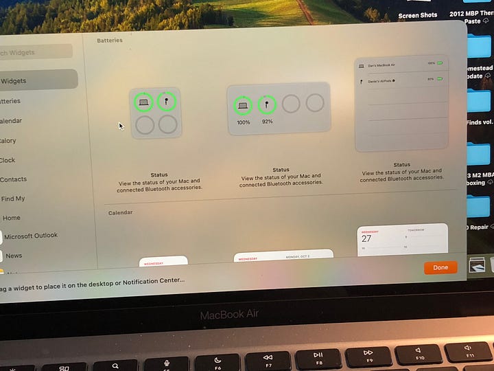
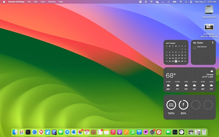
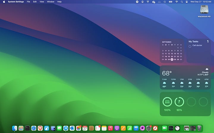
On the desktop they will snap into place in a predetermined grid. It would make more sense to put them on the left side of the since macOS insists on putting desktop icons on the right, but I’m stuck in my ways from my Windows days and prefer them on the right. Just be aware that the widgets will take priority so if you have desktop icons, they will automatically move to make room for the widgets. It’s not a big deal, but it looked a little weird to me, so I moved all of my desktop folders and such into my iCloud home folder.
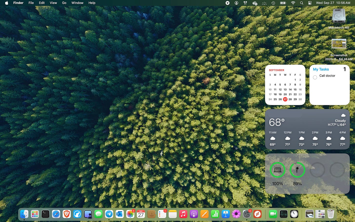
Some of the widgets will also change colors depending on whether you are using a light mode or a dark mode.
Safari Profiles & Web Apps
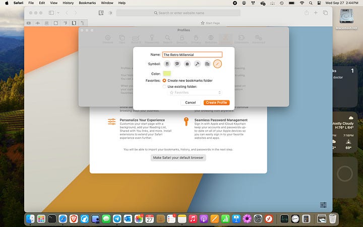
Safari got some pretty nice updates as well. First of all, you now have the ability to create and quickly switch between multiple user profiles. Each profile will sandbox it’s own set of tab groups, bookmarks, cookies, etc. While most people would probably use this for separating their personal browsing from their work browsing, I found it useful to create a new profile for each of my blogs and other writing projects.
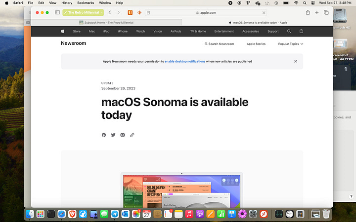
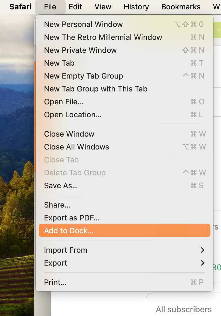
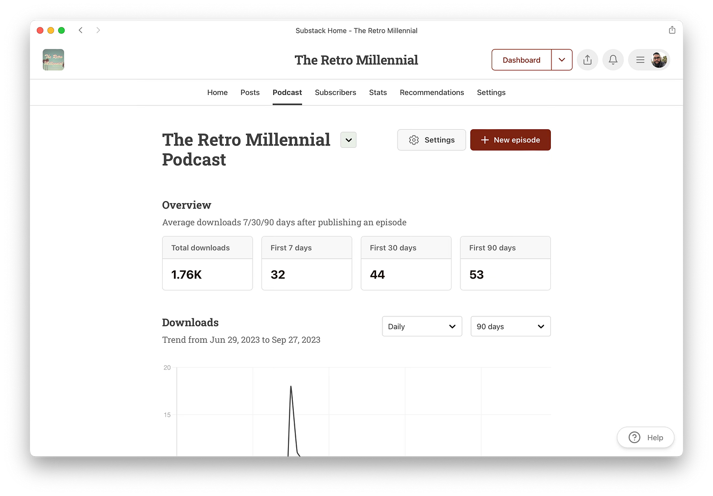
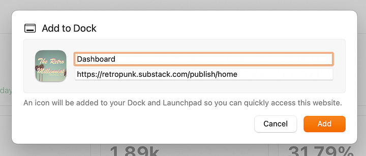
The other big feature in Safari is the ability to make any website into a dedicated web app. To do this, simply go to the web site you want — in this case, I wanted a dedicated app for my Substack Dashboard — click File in the Safari menu, then choose Add to Dock.
Give it a name and click Add. The new “web app” will be added to the dock.

Now, my dashboard launches in it’s own dedicated Safari-like window with a simplified toolbar, no tabs, and no distractions. Is it a revolutionary feature? No. Is it a nice little feature for people who would like that? Sure. Would I still prefer a dedicated desktop app that connects to my dashboard with its own interface over this? Absolutely, 100% yes, but I’ll take what I can get.
Game Mode
Game Mode is a feature that I didn’t do anything with, but I did read up on it a bit. You don’t control it. Rather, the OS will automatically switch over to Game Mode to prioritize CPU and GPU performance when launching a game in full screen. According to Apple, it reduces latency with wireless devices and produces more consistent frame rates in game. I didn’t play anything on my MacBook Air so I had no experience with Game Mode, but it’s here for those who need or want it.
But Wait… There’s More!
In addition to the bigger features I just mentioned, a number of other (sometimes smaller) features were included in this release including:
Video conferencing got some attention this time around. Now, a presenter who is sharing their screen can overlay their face during video calls or even have their screen show up smaller in the corner above and behind them, kind of similar to what you see on news broadcasts. In addition, Sonoma allows you to “react with your hands” — this means giving a thumbs up will make a thumbs up emoji appear, or hearts appear if you make a heart with your hands, etc.
This feature, which is only available for users with an Apple Silicon Mac (M1 or M2 lines, no Intel), surprisingly enough can be used in more than just FaceTime. It sounds like it can also be used in Teams, Zoom, and WebEx. While I don’t necessarily think the use of hand react emojis would be terribly professional on a business meeting, it is a feature that I’m sure some people will genuinely enjoy. With that said, the presenter overlay thing is pretty cool.They made the icons and Spotlight search more rounded at the corners. Most people won’t notice this, but it’s a thing. Heck, I didn’t even notice it until I read about it, and now I can’t unsee it. There’s not much more to talk about though. The corners. They’re more round. That’s it and that’s all.
Password sharing in Safari is a now thing. For years Apple users have been able to share things like WiFi passwords remotely to one another, but now we’ve moved on to shared logins for sites and services. By using this feature, multiple people can be in a group that shares passwords in real time. That means if the password gets changed, the change is automatically applied to everyone else in the group. This could be a pretty sweet feature for families. I also believe — though don’t hold me to it if I’m wrong — that if someone is removed from the group they lose access to those passwords.
Animations are smoother now when signing in at the lock screen and when triggering the notifications panel.
Jump to first unread message in Messages, along with improvements in search and changes to stickers.
First Impressions
Live desktop wallpaper/screensaver: Is this useful? Does it have a practical computing purpose? No, but it does look nice. I could easily imagine an average consumer upgrading their M1 iMac in whatever fun color they chose and enabling the screensaver as a moving piece of decor in their apartment. In some ways, as far as I feel Apple has strayed from the Steve Jobs years of the late 90s through the early 2010s, this almost seems like something he would have pushed for to continue that mission of making the Mac the center of your digital life — even if the smartphone is that for most people nowadays.
That said, I was honestly surprised at just how many of these animated wallpapers they gave us. There are 134 in total at the launch of Sonoma — 61 landscapes, 30 cityscapes, 21 underwater, and 22 of the earth from space. Only one or two of these are preinstalled so you’ll have to download the rest, but it’s nice how much variety there is.
The widgets are okay, but I really wish you had the ability to adjust the size of them. macOS will let you choose between 2 or 3 preset sizes like on iOS, but they are quite large on a 13 inch display.
As far as the web apps in Safari go, it’s okay. I don’t know how much I would actually use them, and honestly in the weeks since taking the screenshots above, I’ve stopped using the web app I made because my workflow involves tab hopping a lot. Maybe it’s just my ADD brain? I do like the new profiles though. It’s a feature that’s been in just about every other browser for a while now, so it’s nice to see Apple finally catch up.
After a couple weeks of use, I would say Sonoma is a solid step up from Ventura. It seems a bit snappier and responsive based on my use of it. The visual enhancements really set it apart and makes it look great. That said, aside from Game Mode, I don’t see a ton of changes or improvements under the hood. This definitely seems like a treat for consumers who want pretty things. However, if you still prefer the more traditional OS X desktop paradigm of older systems, you’ll be disappointed. Apple is clearly aiming to make the Mac as much like the iPad as possible and that’s not something I like.
Overall, Sonoma is a nice operating system. If you’re a Mac user and you are all in on the ecosystem with an iPhone, iPad, AirPods, Apple Watch, AppleTV, etc then the continued integration between all of them will undoubtedly make you happy. Obviously, you don’t need to have all of those devices to enjoy Sonoma, but it really shines with them. For me, personally, I liked it but still prefer older systems like Catalina to it.


