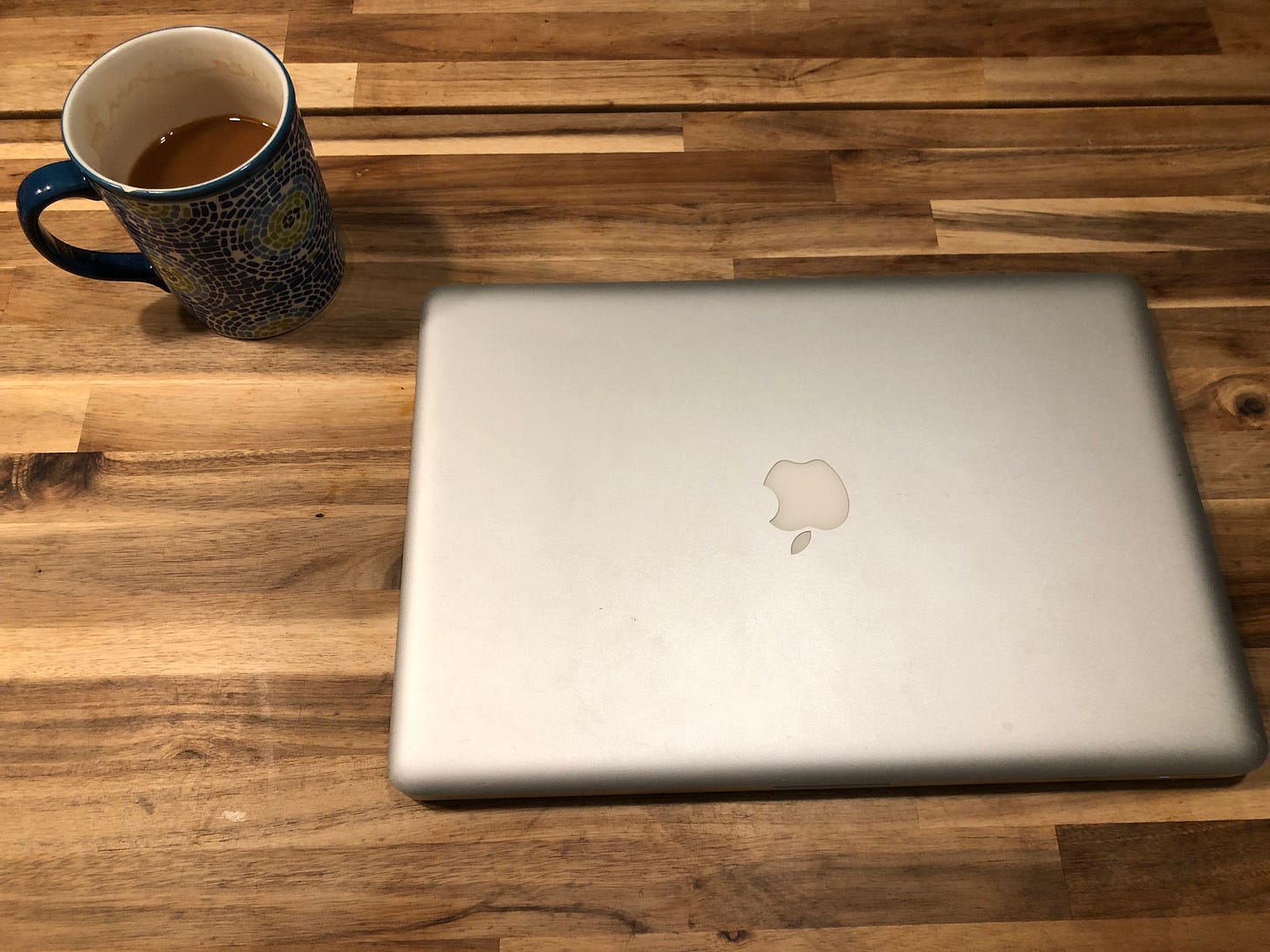
This is my mid-2012 MacBook Pro and a cup of delicious single origin Cuban coffee.
I acquired it back in 2018 when someone offered it to me in exchange for my first MacBook — a mid-2009 white unibody model. I do miss that one and wish I still had it, but this one has been good to me. It’s been my daily driver since then and it’s served me well. I upgraded the RAM to 16 GB and swapped the old spinning disk drive out for a decent SSD, and the thing ran like a dream. I’ve moved more to using my M1 Air for most of my daily work these days, but I still like this one. It’s a solid build with a great keyboard and trackpad, and it’s got all the ports I need along with an optical drive — yes, I’m the one you’ve heard about still using optical drives in 2022.
Since I don’t use it as my primary machine these days I’ve started thinking about what all I can do with it. It’s up-to-date running the latest version of macOS 10.15 Catalina which is the last officially supported release from Apple, but I like to hop around and try out older versions of macOS just to see what all I missed over the years. You see, I didn’t get my first Mac until 2016 so by that point a lot of releases had passed, including some of the best. So I set out to see what I could get to run on this thing.
Mavericks
For those of you who are unfamiliar with the development history of Mac OS X, basically everything after 10.10 Yosemite looks and feels pretty much the same to me. That was when they switched to the flat UI that we’re used to seeing today. Now don’t get me wrong, it’s a nice UI, but when I think of older versions I think of the design language of the early-mid 2000’s and up to the early 2010’s. So I figured the first step should be to go back to the last version of that older design which is OS X 10.9 Mavericks.
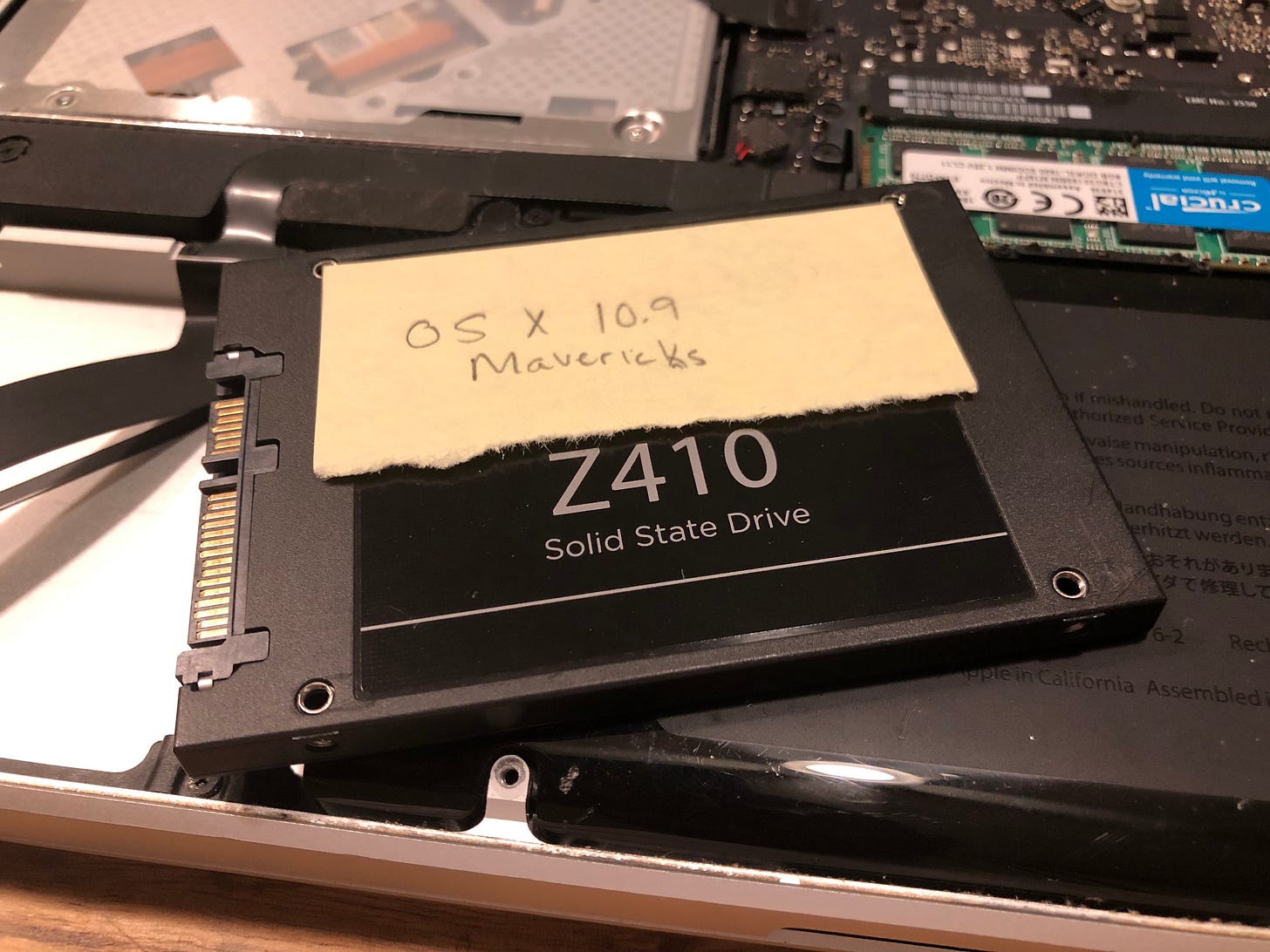
Mavericks, I believe, was the first version of OS X to be released as a free upgrade through the App Store. I remembered hearing people talk about it and getting super excited for it so I figured why not start there. First I removed the Catalina drive from the laptop because I didn’t want to overwrite the system I’ve curated over the last half decade. Fortunately I already had a disk with Mavericks installed from a while back (a topic for another article down the road) so we’ll just use that.
Once the drive was installed we booted the old girl up and man was it fast! These older systems, while resource hogs for their time, are nothing compared to what modern macOS requires. Once signed in, we land on the desktop.
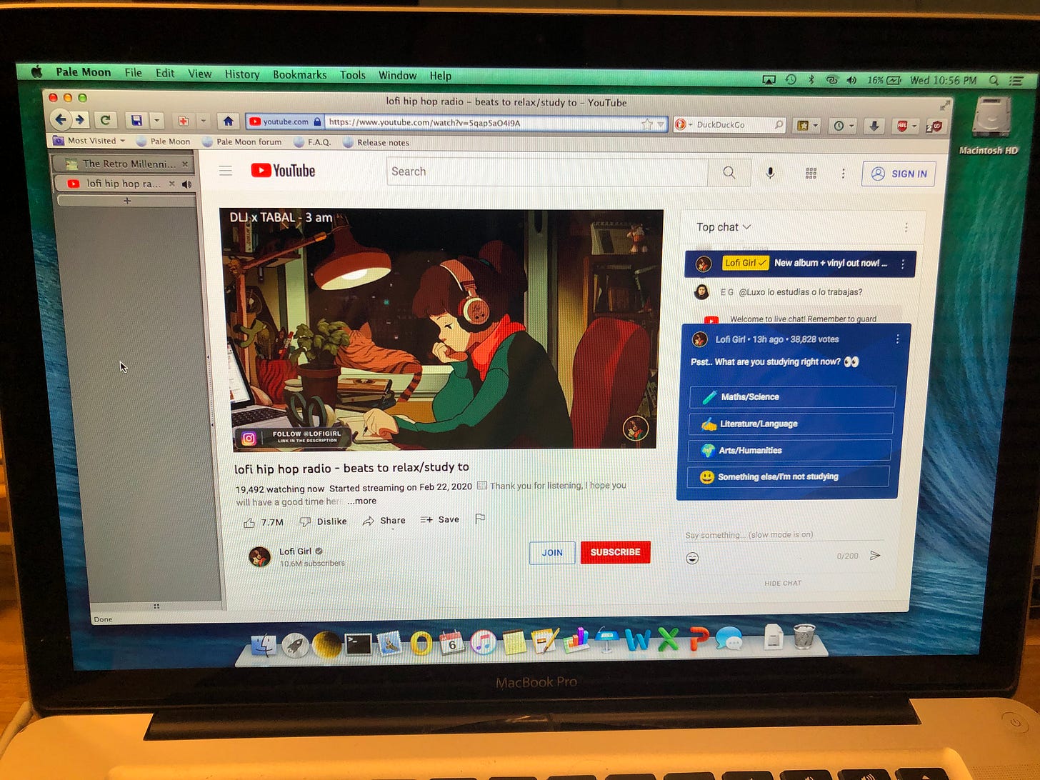
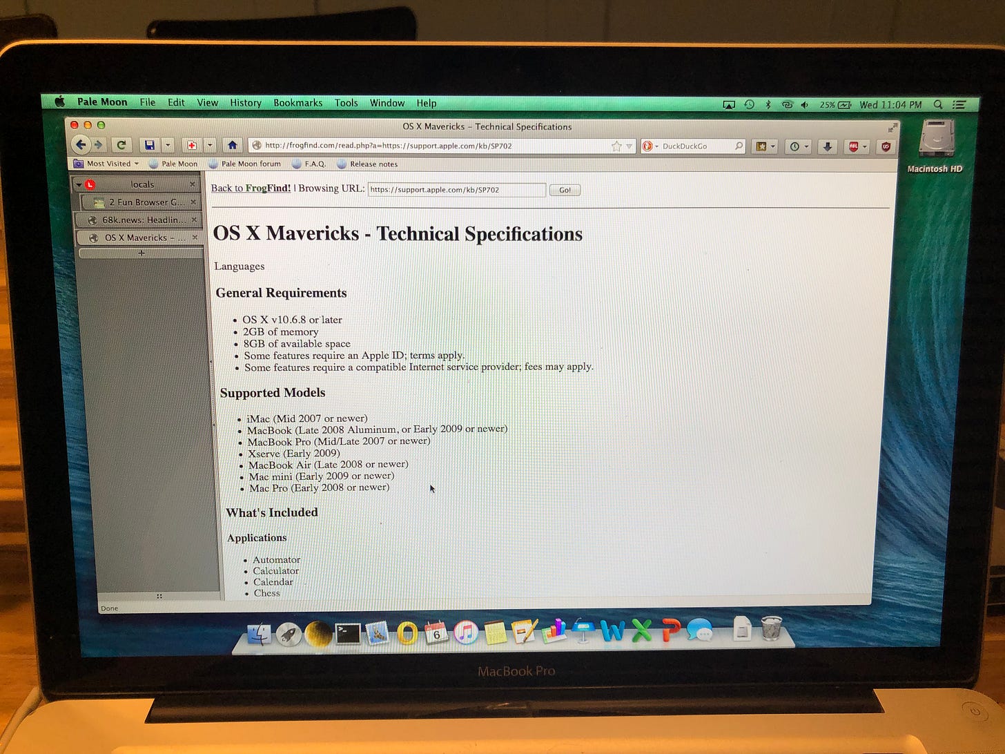
So what should we do first? Well as most of our lives these days are dependent on the internet I suppose we should start there. Unfortunately, Safari on Mavericks is useless. It fell out of support years ago and most modern sites just refuse to load so we need to find a working alternative. My usual go to for these old systems is the SeaMonkey Internet Suite but I figured why not try something a little bit different this time? So let’s turn to the Pale Moon web browser.
I like Pale Moon. I’ve used it on my old Windows 2000 and XP laptops and I’ve used it on Linux, but this was my first time trying it for Mac and honestly I was surprised at how well it kept up. First up, let’s see if it can handle video playback.
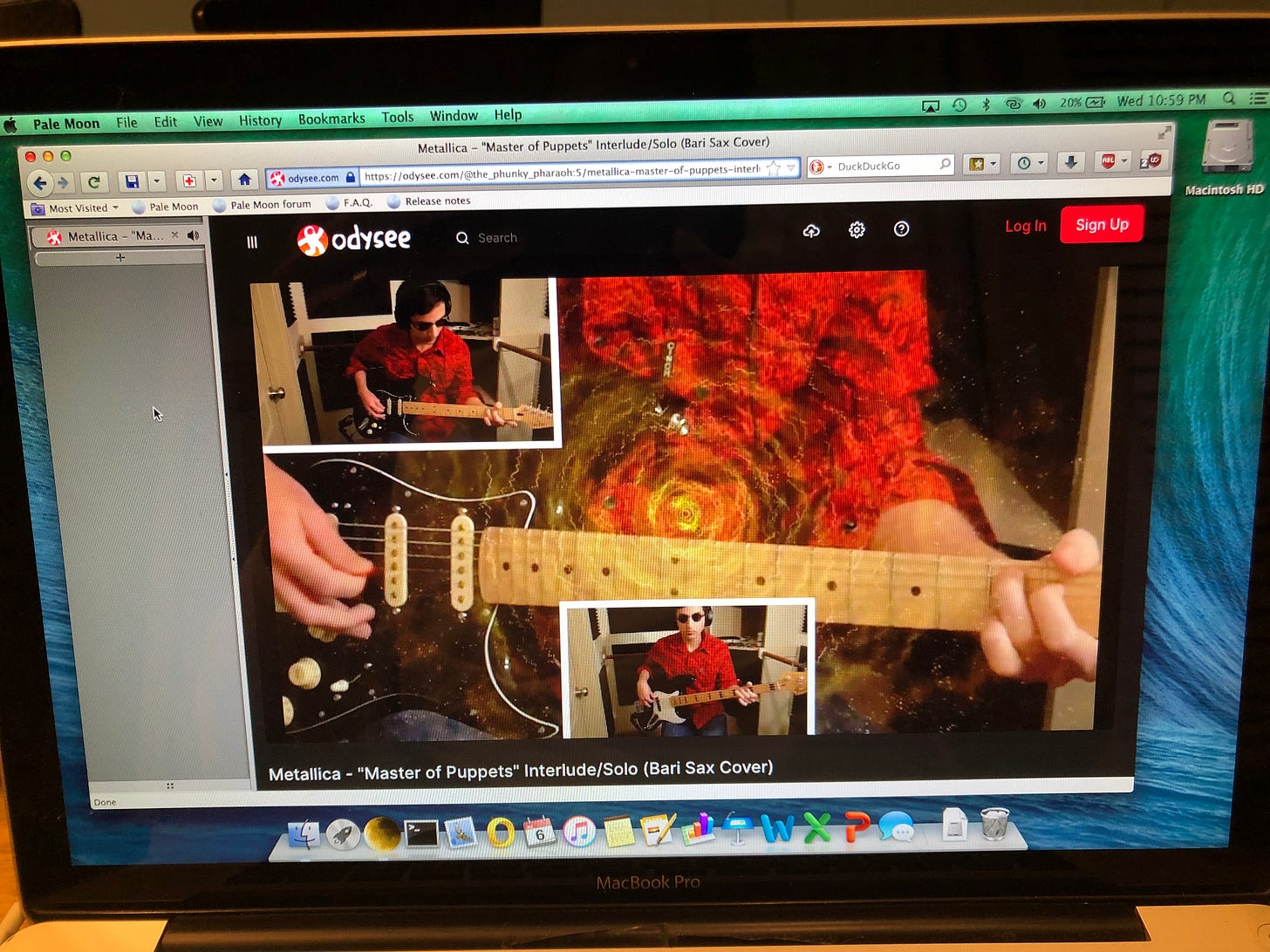
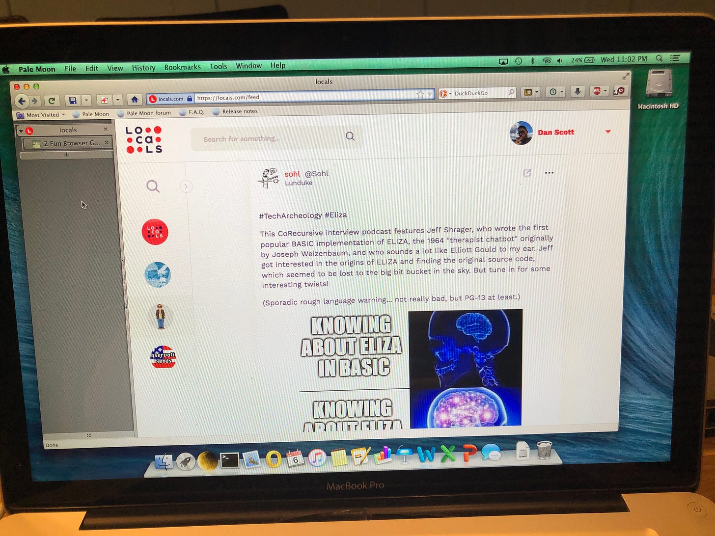
Well it’s a little sluggish, but honestly YouTube and Odysee both work just fine here. Oh and if you hadn’t noticed, I installed the Tree Style Tabs extension to give me the vertical tabs. Otherwise, the tabs are right below the address bar as God intended. Now what about social media? Well I’m not a fan of most social media sites so let’s try the one that I actually still frequent.
Locals works just fine. I tried playing audio and video, scrolling, and commenting. Everything worked as it should. Honestly a little surprising for a nearly 10 year old operating system and a deprecated browser. What else can we do?
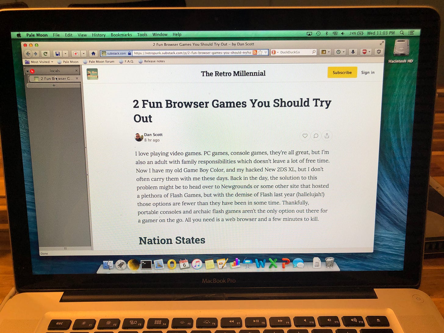
You can read Substack articles just fine, but signing in seemed to be problematic. Substack prefers to send a sign in link to your email, though you do have a password option as well. My email provider of choice is ProtonMail but this old browser just couldn’t handle their webmail UI, and when I tried to choose the Sign in with Password option it just sat there. Maybe if I’d used a different email provider it would have worked better, but until I find a workaround you’d have to keep a more modern system around if you were going to publish things here.
I also tried to use Wordpress but gave up after waiting 5 minutes for the reader to load and having trouble signing in.
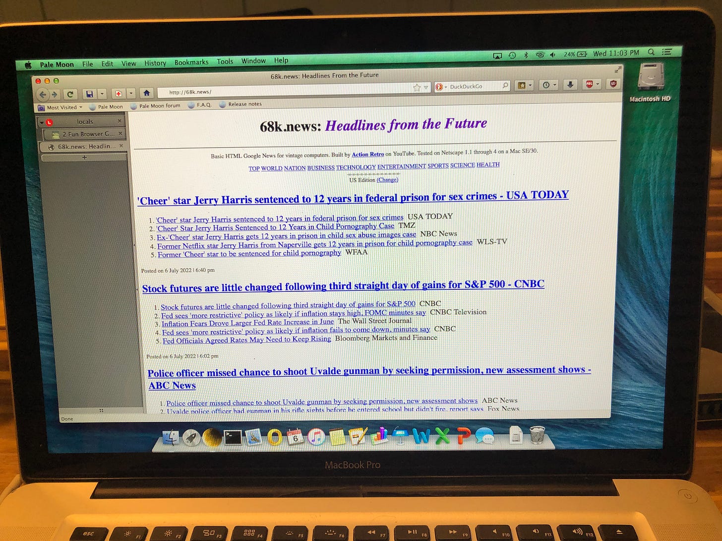
Of course 68k.news works just fine and is snappy as ever.
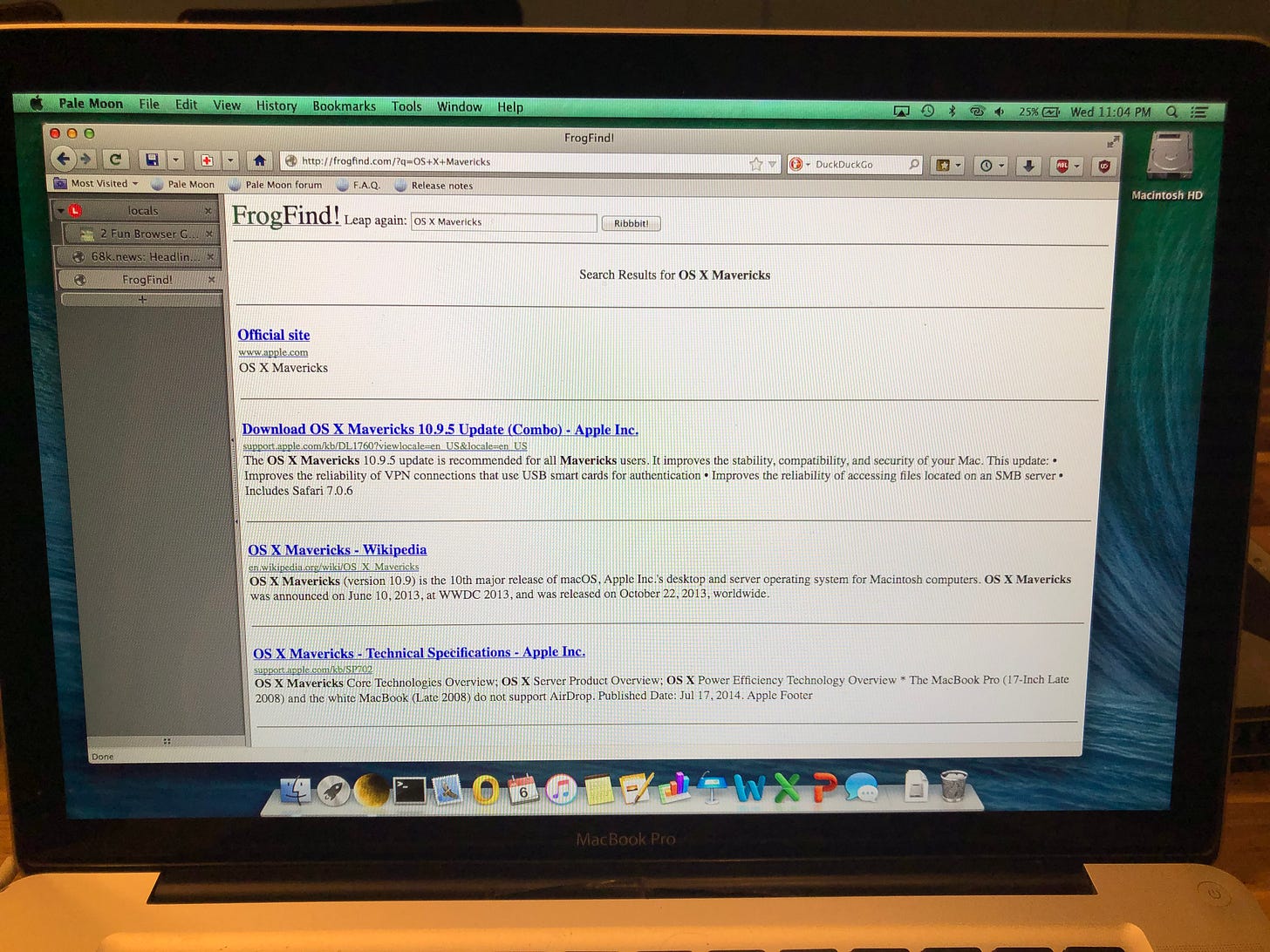
Frog Find too.
Using Frog Find, even Apple’s over-bloated website loads in a flash!
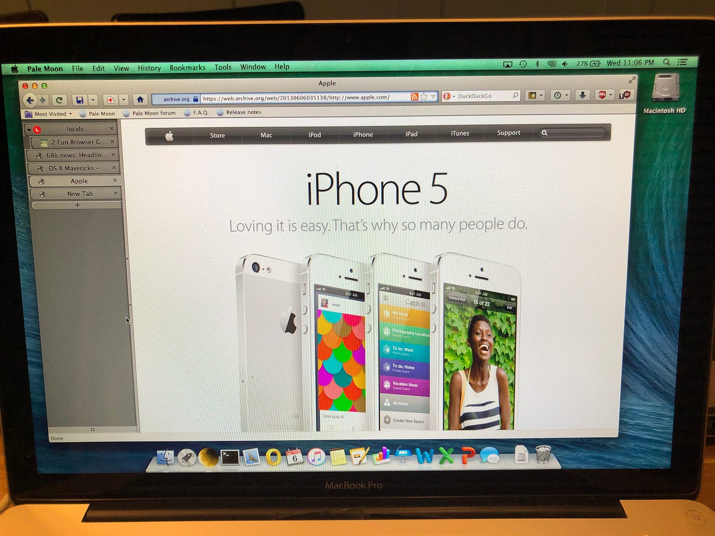
And for nostalgia’s sake, I figured let’s check out what Apple was pushing on this day back when this system might have been used. It’s kind of crazy to think that the iPhone 5 was the next big thing back then.
Overall, I feel like Mavericks is still a pretty solid system in 2022. I may even return to it in the future and see how far I can take it, but for now let’s keep going back.
Mountain Lion
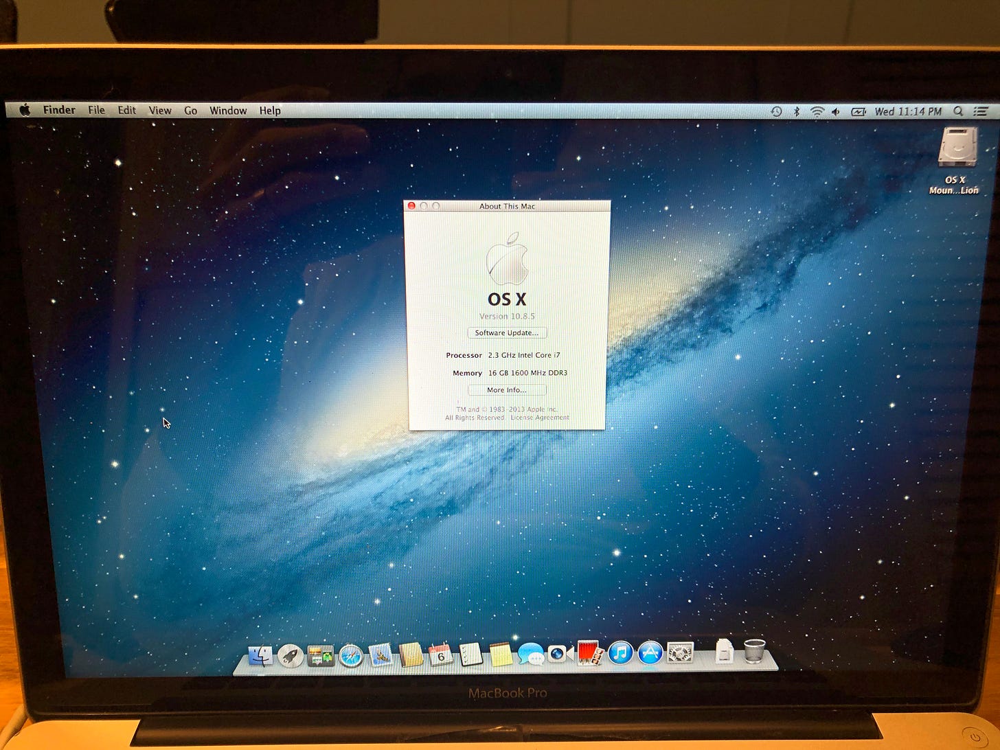
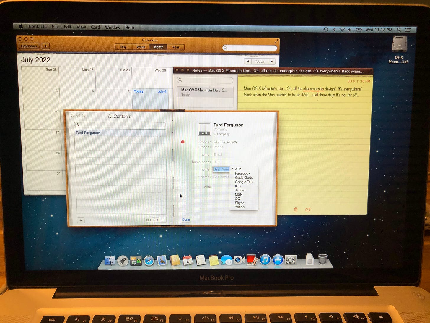
Well Mavericks is still great on this old MacBook Pro, but what about the system it originally shipped with? OS X 10.8 Mountain Lion was a interesting system from what I’ve seen. It had some cool features introduced, but it changed the design language to be much more skeuomorphic like the iPhone and iPad of the day.
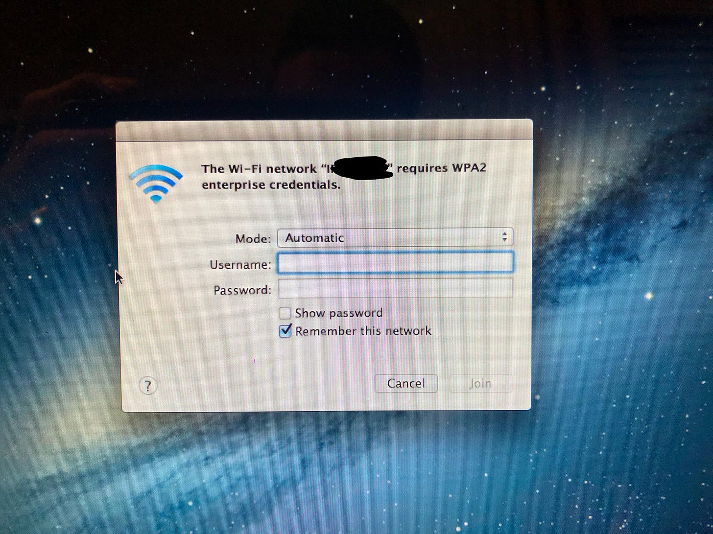
I never used Mountain Lion before so I wasn’t really sure what to expect. The first thing I noticed was that I wasn’t going to be able to get online right now.
I live kind of out in the middle of nowhere and we haven’t gotten real internet yet, so I have to run off of my phone’s hotspot. Usually this isn’t a problem, but on older operating systems I’ve noticed they do not like this more modern setup. On older versions of OS X (10.0 - 10.8) it thinks my hotspot is an enterprise WPA2 network and I cannot, for the life of me, figure out how to get it connected. Maybe once we get our fiber line run I’ll try Mountain Lion again. But in the meantime, let’s take a look at the unique UI changes that were only in this release.
I for one am not a huge fan of the skeuomorphic design language, and never have been, but I do think there is something kind of charming about the level of detail used. For instance, zoom in on the notes app and you’ll see what looks like torn pages along the top of the yellow note pad, and the leather texture at the top of the calendar. I think it might be a cool system to run for a while, but unfortunately without a working internet connection I can’t do much else with it right now.
Tiger
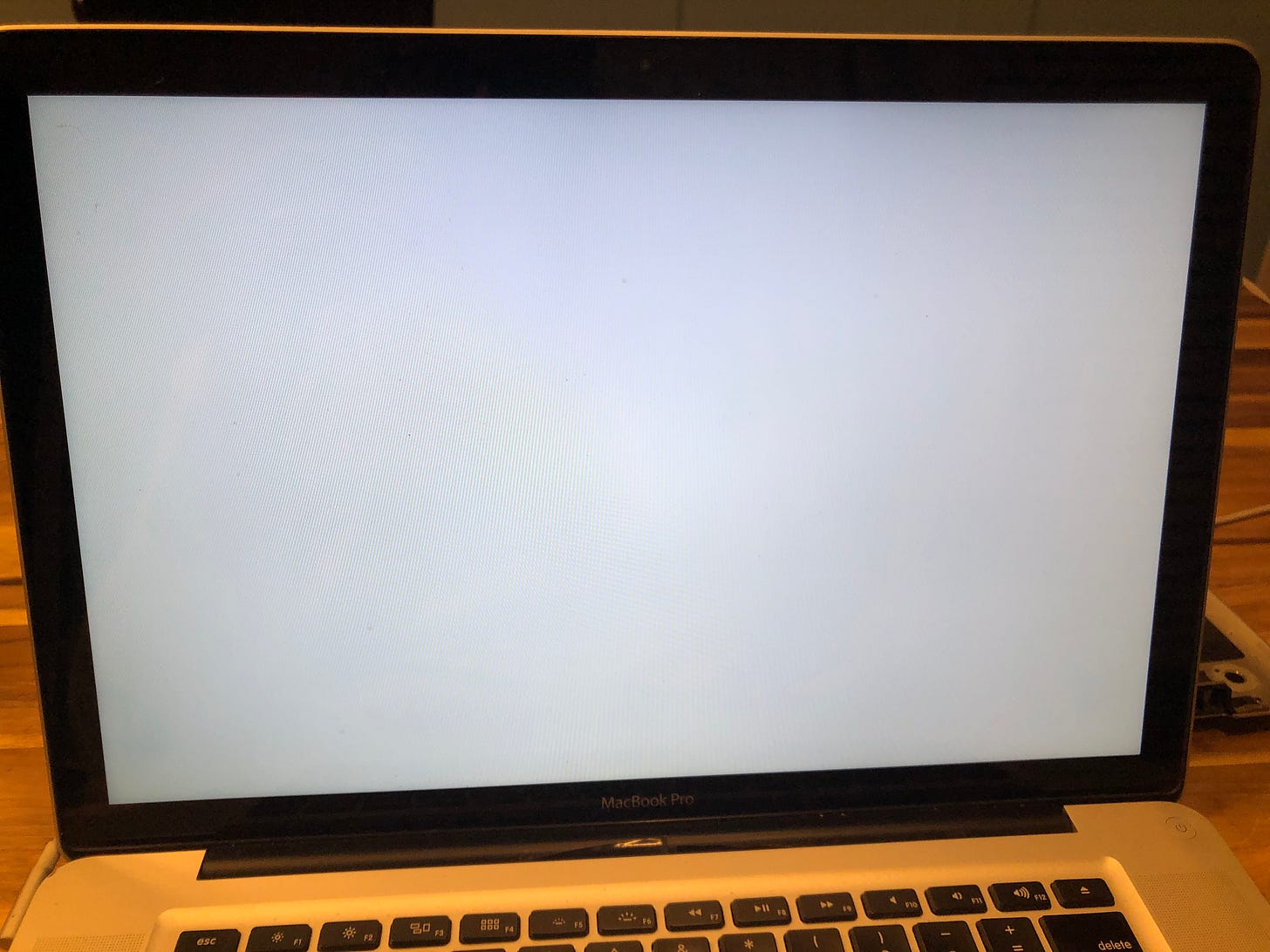
Okay, so I knew that this shouldn’t work. Apple has made it clear that it’s not possible to run an older version of OS X than what a computer originally shipped with, and OS X Tiger (version 10.4) came out WAY before Mountain Lion. I know the operating system won’t let us run the installer, but what happens if I take a drive that already has Tiger installed and just throw it in? Let’s find out!
A whole lot of nothing. Well that’s not surprising. It sat on this white screen for about 15 minutes before I shut it off.
I think the biggest take away from this is that in some areas old versions of OS X still hold up quite well, while in other areas they are clearly obsolete and useless. Web browsing on old macOS, just like on old Windows and old Linux, can be a chore, and sometimes just doesn’t work, but when it comes to the core offline system they can be cool. Unfortunately, Apple has had a focus on leaning into the internet with their desktop experience since the late 90’s so that can cause their non-browser based desktop experience to be lesser than other operating systems, but you can definitely still have some fun with old Macs in this way.




Personally, I have used every version of macOS from classic to today (though not all when they were current). The early OS X stuff is great! I personally think that the UI has gotten worse over time. Macintosh System 6 and 7 were phenomenal, and 10 - 10.4 were amazing. After macOS Mavericks... it's kind of just down hill. I have a similar feeling for Windows. With Windows, 3.1 or 2k are the best UIs Microsoft achieved, and everything else is kind of bad, and it got worse progressively after Vista.