Make Windows 11 Look and Feel More Like Windows XP (or Classic Windows)
About a year or so ago Microsoft launched Windows 11 with a leak, an overly emotional keynote video (with broken sound in parts), and a lot of people irritated with the arbitrary hardware limitations they put in place. With that said, the design changes did get some people excited. The windows had curved edges, the icons were flatter with more vibrant colors. The taskbar was… different. The start menu… was different. But the notifications pane, widgets, and system controls all got a refresh that were pretty easy on the eyes.
When the announcement was made, I thought it looked nice, but wasn’t going to buy new PC parts to upgrade my Windows 10 box at home. However, at my old job I was issued a Microsoft Surface Pro 6 and I was in the Windows Insider program at the time so I decided to push ahead and get it installed. You can read about that experience in this article. Ultimately I didn’t like the changes and I went back to Windows 10.
Fast forward a year and I’m at a new job. We’re still a Windows shop but we’re mostly all still on Windows 10 except for a few of us who got bumped to test Windows 11… I’m in that camp. Overall it’s been a better experience than it was when it first launched, but I’m still not a fan of the new UI design so I decided to do something about it.
I decided to turn Windows 11 into Windows XP.
Metamorphosis
This is Windows 11.
Some people like it, I’m sure; and to be fair this isn’t the worst thing I’ve ever seen. I just prefer the more classic desktop paradigm when it comes to Windows. Let’s see what we can do with it.
The Desktop
Let’s start with the most iconic part of Windows XP: the wallpaper. XP came with many different wallpapers, and of course you could add your own, but there is only one that can be considered THE Windows XP wallpaper: Bliss.
The Taskbar
Next we need to deal with the taskbar. This is a little tricky because Windows 11 not only moved the icons and start menu to the middle (an easy fix), but they also locked the size of the taskbar to extra large or something which just doesn’t fit. We’re going to need edit the registry, then install a nifty little program called RetroBar.
Press the Windows key (aka Super Key) and R at the same time to open the Run dialogue.
Enter regedit and press enter to open the Registry Editor.
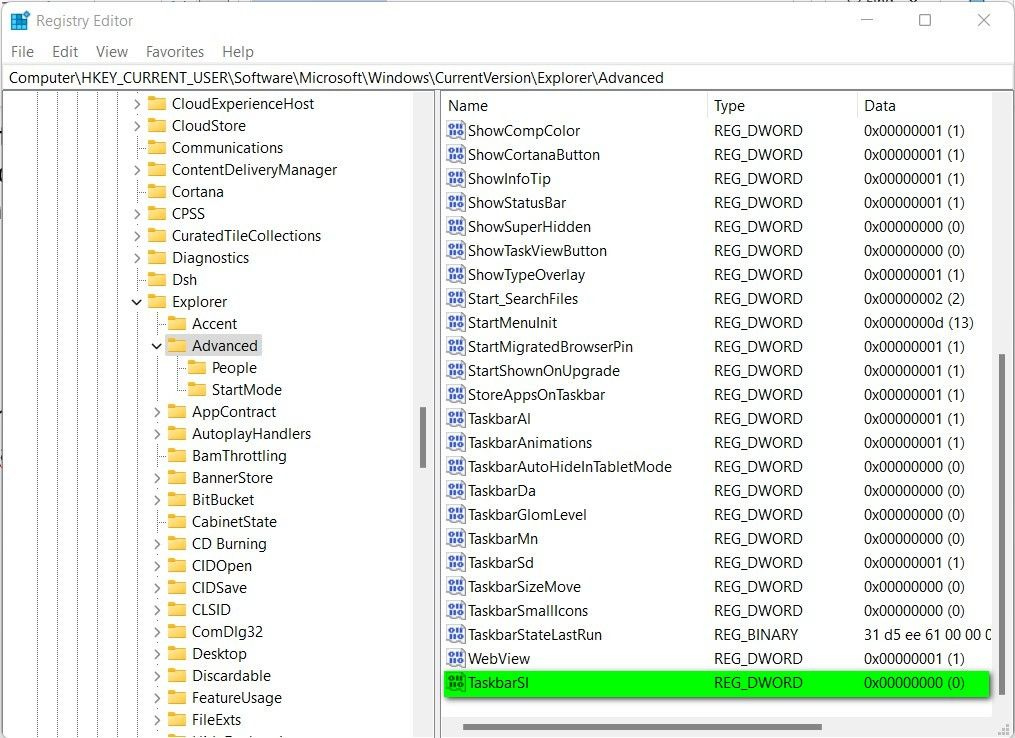
Navigate to HKEY_CURRENT_USER\Software\Microsoft\Windows\CurrentVersion\Explorer\Advanced\
Right click on the Advanced folder and create a new DWORD (32-bit) named TaskbarSI
Set the DWORD value to 0 to make the taskbar small with small icons.
Restart Explorer.exe to apply the changes.
To restart Windows Explorer, open the task manager, find the Explorer.exe process and click restart.
Alternatively, just restart the computer.
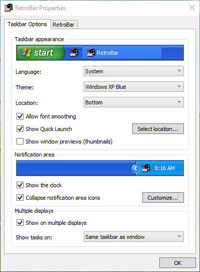
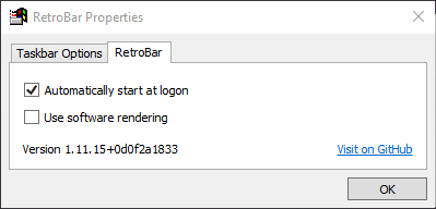
Next, install RetroBar. Once it’s installed and running, right click the taskbar and choose Properties. Here, we can adjust the theme to XP Luna and tell RetroBar to automatically run at startup.
The Start Menu
One of the biggest changes Microsoft made to Windows 11 was the start menu. For some reason Redmond has decided that we can’t have nice things so they took away the perfectly acceptable start menu from Windows XP/Vista/7 and gave us all of the trash since Windows 8. Admittedly, the Windows 10 start menu wasn’t awful, but it wasn’t great either. Windows 11, on the other hand, took the mobile-minded launcher from Windows 10X — the failed mobile project from a few years back — and decided that’s exactly what we needed.
To fix the new menu problem we’ll have to go back to Open Shell, a fork of the abandoned Classic Shell from the Windows 8 days. To be clear, I’m not a huge fan of Open Shell. It’s not bad, but it’s not great either. There are a lot of options and skins available to customize your start menu but to get the minor details fixed you’d have to go in and start editing program files and that’s not great for normal users. I’ll show you what I mean later in the article. For now, just set the Start Menu Style to Classic with Two Columns and the Skin to Windows XP Luna.
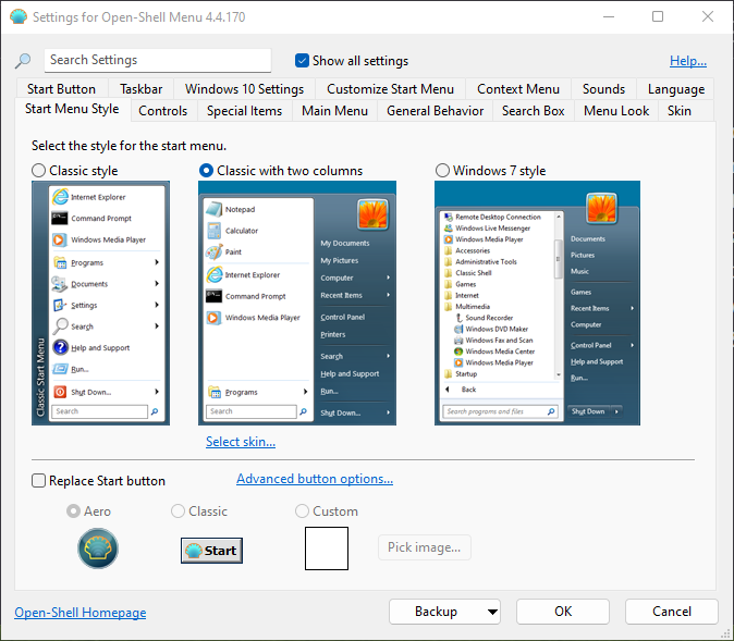
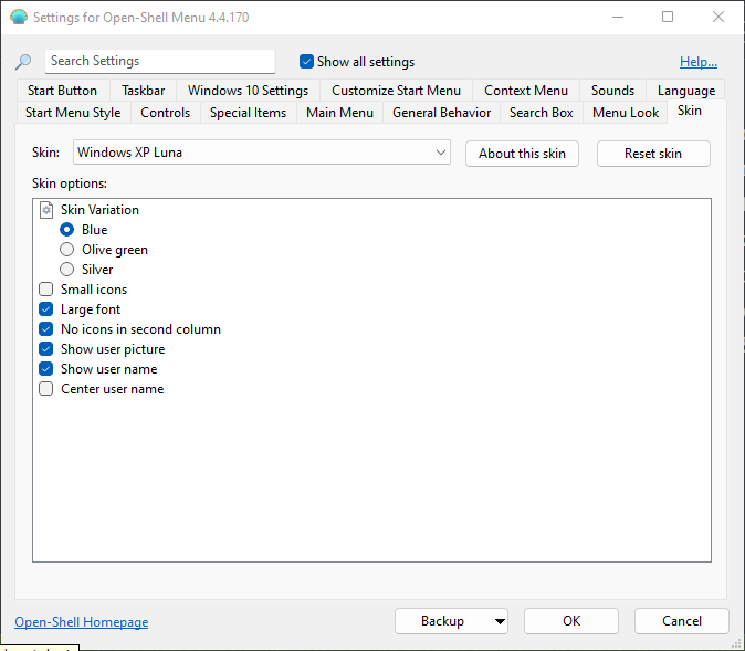
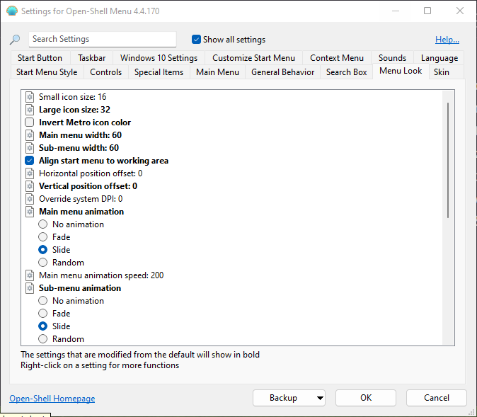
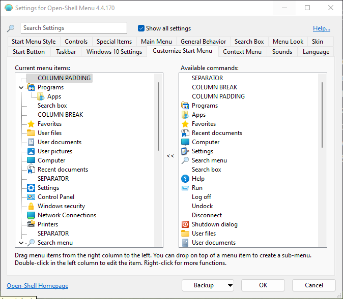
For the first few days after making the changes to the desktop Open Shell seemed to struggle with it’s vertical alignment. I assume this is because of how the Windows 11 start menu is set to hover several pixels above the taskbar. Nevertheless, this can be adjusted in the Menu Look tab as shown above. I’ve had to adjust this several times but lately the issue has gone away and I’ve reset the alignment to 0.
Also, by default Open Shell’s menu layout doesn’t look right so changes need to be made. I’ll work more on this later, but the main change I made was moving the Apps folder into the Programs folder and renaming Programs to All Programs.
The Title Bars
There is one obvious thing missing from my desktop so far and that is the title bars. Windows XP had two title bar options: Luna and Classic.
There are a ton of discussions on forums and videos on YouTube with ways to make Windows 8/10/11 kind of reminiscent of Windows XP or Classic Windows, but to be honest none are very good. Most are constrained to the built in Settings which really restricts what you can do. You can change the boarder color, but cannot apply a gradient. You can’t adjust the window control button sizes. You can’t — to my memory — change the window font or alignment, so you end up with something like this…
See what I mean? It’s fine for what it is, but it’s just not visually correct and that bothers me.
I’m still searching for something FOSS that I can use to achieve what I’m looking for but I’ve yet to find it. If I can’t find something that will work, I may just bite the bullet and buy a license for WindowBlinds 11 from Stardock.
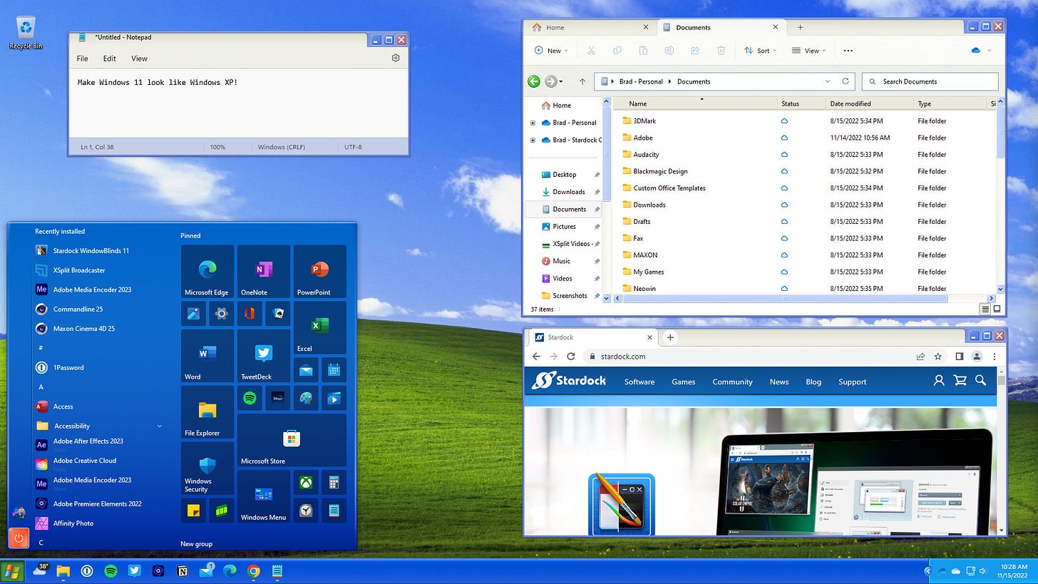
The Mundane Details
Now you can stop there and you’ll have a decent looking homage to Windows XP, or you can keep going down the rabbit hole and fix more of the design changes and default applications.
Curved Window Edges, Context Menus, Window Switching
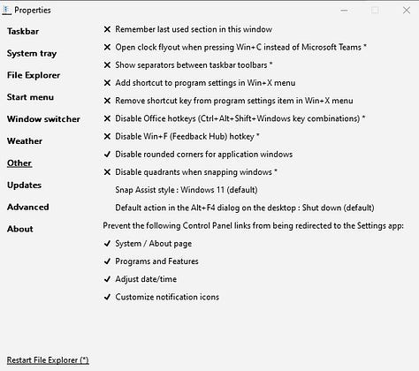
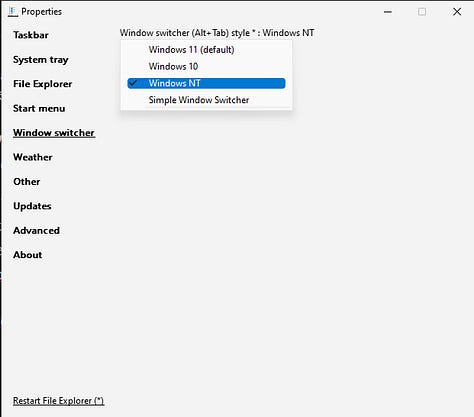
There is a nifty little program called Explorer Patcher that makes changing a lot of these features easy. I used it to disabled the curved window corners, set the context menus back to the sensible way they used to be, and set the alt+tab window switching back to how it was with older versions of Windows.

Web & File Browsers
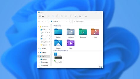
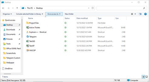
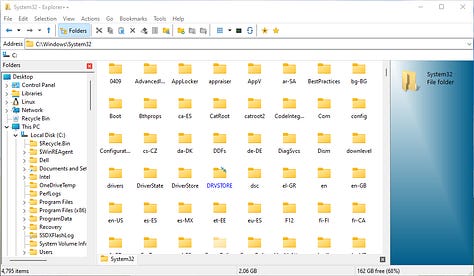
The new Windows File Explorer is mostly the same, though in newer builds they have added tab support which is pretty cool. My problem with it, is the size of the icons and menu bars. They feel like they’re geared more toward touchscreen devices. You can change those things in Explorer Patcher to restore the Windows 10 Explorer settings, or you can try something completely different like the open source Explorer++.
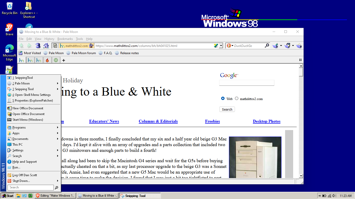
Now if you really have a craving for a more authentic Windows XP experience on the modern web, you can try something like Pale Moon. The current release — version 31.4.1 — is a fork of Firefox 4. It works on most websites, though some of the more javascripty and HTML5y sites give it some trouble. It’s not perfect, but I like it well enough as a secondary browser.
Bring Back Winamp!
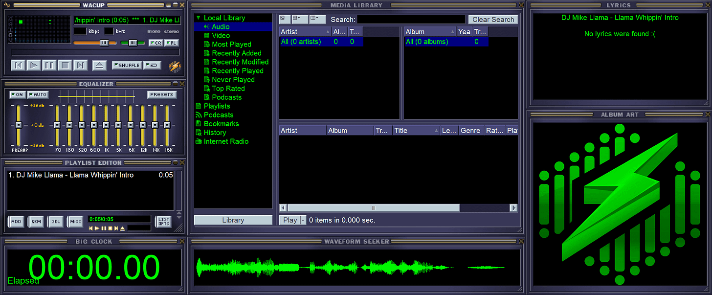
Of course Windows Media Player is still available if you’d like, but it’s significantly newer than what you’d get with XP (at least until years later in it’s life). Back in the day, the heavy hitter was Winamp. “But Dan,” you say, “Winamp died in 2013, and the new one isn’t really Winamp.” That is correct, but lucky for us we have an awesome project called WACUP. WACUP, or the Winamp Community Update Project, aims to bring us back to the glory days of the Winamp media player.
More Work to be Done
As of writing this, that’s all that has been done. It’s not bad if I say so myself. Sure, there’s more to do to get it just right. I need to edit the Open Shell files to fix the fonts and adjust the layout, I need to change the icons out, adjust the sounds, and figure out how to retheme File Explorer or Explorer++ but overall it’s not bad.
But say you want to go with a more classic Windows look and feel? Just adjust Open Shell, RetroBar, and the wallpaper. In this case I went with a Windows 98 vibe.
Here you see the issue I was talking about with Open Shell. The color scheme doesn’t fit the Windows 98 taskbar. It works pretty well, but it’s an annoyance to me. I’ve found setting RetroBar to Windows Me with it’s lighter colors helps, but it’ll be better once I adjust the program files to get it just right.




My method is much easier.
1. Go to Ebay
2. Buy a genuine copy of Windows XP (because we don't like pirates)
3. Nuke and Pave your system (because backups are for wimps)
4. Enjoy a simpler, more relaxing time